Command center
Paid revenue dashboard
Spend, CRM quality, activation, pipeline and revenue views designed as one weekly operating room.
paid spendCRM reconciliationBI rhythm
ninox_paid_revenue_dashboard_command_center.html · sanitized representationNot another chart wall. The work is process mapping, CRM/ERP handoffs, automation logic, metric definitions and reporting views that make operations and growth visible in one place.
Spend, product signals, CRM quality and revenue meet in one view — then loop back to L1.
A dashboard is L5: the layer where spend, product, CRM and revenue finally agree — and drive the next move.
Illustrative numbers — the structure is the point: paid, funnel and revenue views on one model. Switch tabs, watch the counters.
| Question | Answer | Owner |
|---|---|---|
| How many leads last month? | 240 (Ads) · 180 (GA4) · 95 (CRM) · 130 (Excel) | Four people, four numbers |
| What did a customer cost? | "Depends who you ask" | Nobody |
| Which channel pays back? | Unknown — revenue not joined to source | — |
A dashboard is not one object. It can be a weekly command center, a campaign optimization cockpit, a lifecycle board or an operations/ERP view. Each one needs different ownership and source rules.
Spend, source, signup, activation, CRM quality and revenue joined into the weekly leadership view.
Ninox / Plunet patternCampaigns, ad groups, keywords, search terms, quality checks and next-action queues in one workbench.
Search dashboard patternContacts, stages, owner tasks, source fields and handoff quality made visible before reporting.
HubSpot / CRM patternOrder, ERP, stock, warehouse status, exceptions and customer-impact reporting connected to source.
Tavazo / commerce patternThe real work behind the dashboard offer is a family of tools: paid revenue command centers, search optimization cockpits, GTM/GA4 operating files, wireframe systems and CRM/revenue handoff maps. The cards below summarize those artifacts without exposing private client data.
Spend, CRM quality, activation, pipeline and revenue views designed as one weekly operating room.
Campaign, ad group, keyword and search-term cleanup queues for launch improvement work.
Design canvas, content workspace, section notes, export flow and handoff logic in one build artifact.
Audience routes, source rules, lifecycle owners and event logic kept close to campaign execution.
The bridge between signup, activation, CRM status, sales ownership and reporting truth.
The examples below are sanitized from working reporting tools and launch dashboards. They show the kind of structure behind a dashboard sprint: source definitions, CRM reconciliation, queues, quality checks and weekly decision rhythm.
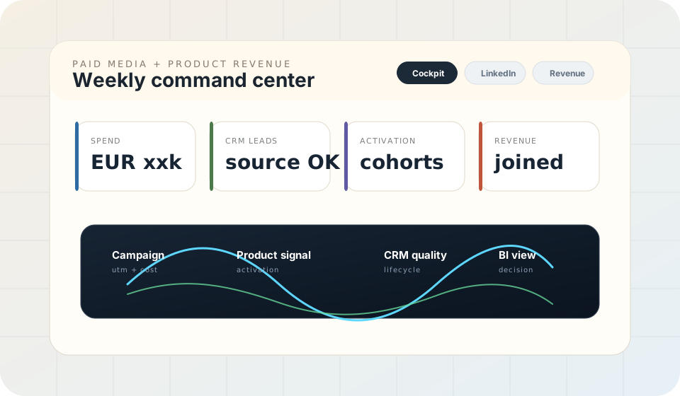
Based on a paid-to-revenue reporting artifact: campaign spend, product activation, CRM quality and BI reporting are treated as one operating layer instead of four disconnected reports.
BI, executive reporting, lifecycle analytics and product behavior.
 Looker Studio
 BigQuery
 HubSpot
 Mixpanel
The first 80% is process, handoffs, definitions and automation - that is why this sprint starts with the operating model, not a chart.
What exactly counts as a lead, an activation, revenue — written down, agreed, versioned.
Where every number lives, how sources join on one key, and a BI-ready model in Looker Studio or Power BI.
Workflow map, automation logic, reporting model and handover documentation.
Scope the sprintReporting should not be an archaeology project. Build the operating model once.
Scope automation & reportingThe free audit's reporting section takes five minutes and usually explains the last three confusing meetings.